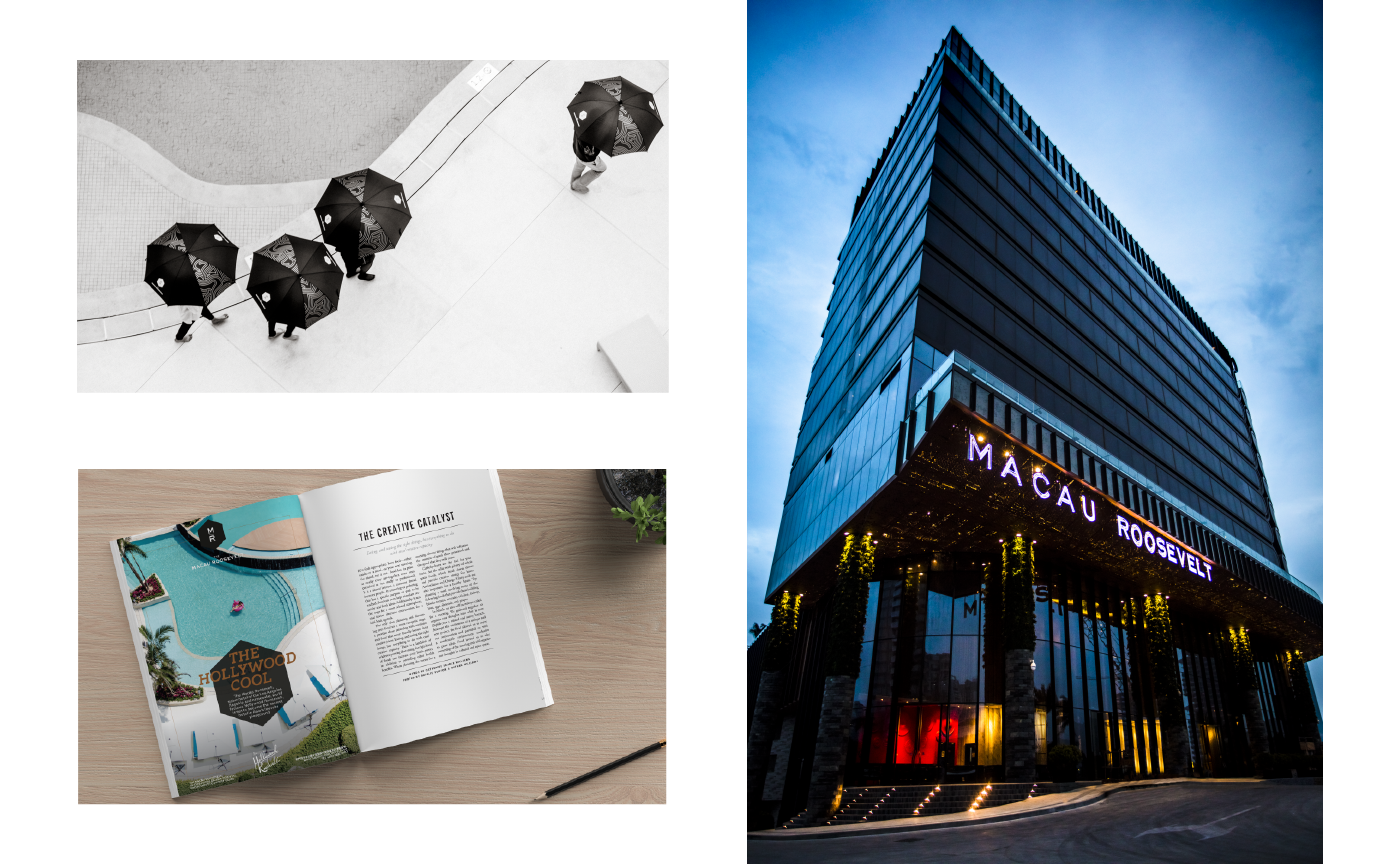
The Macau Roosevelt / Branding
The Macau Roosevelt is the sister property of the iconic Hollywood Roosevelt, in L.A., opened in 1927 on Sunset Blvd.
The building and its edgy interiors have been imagined by the great Gulla Jónsdóttir Architecture + Design, and the whole project was driven by the SE Asian pionniers, GCP Hospitality
Photography by Kelly Puleio
From Hollywood to Macau, From Retro to Modern
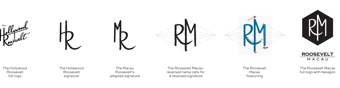
Before coming to its final version, the hotel went through various names. It was first meant to be developed as a twin sister of the Californian landmark.
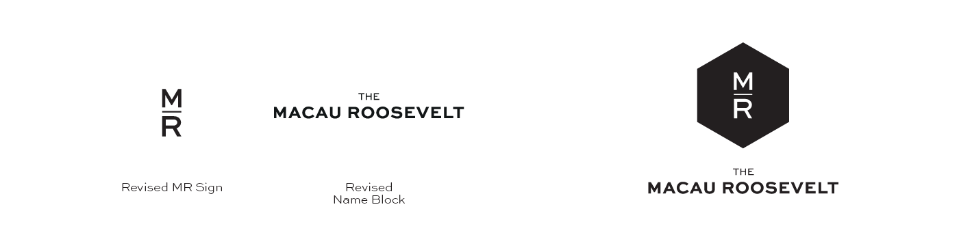
We had then worked to create Macau's logo to be consistent with the design used in the USA, then shifted with the several name changes. As the project evolved, architecture and design shifted to way more modern and intricate looks, slowly unmatching the vintage vibe of the branding.
We have been handed an intermediary logo, that we adapted to our previous research, allowing us to have a hint of connection to the sister brand.
Building on Greatness
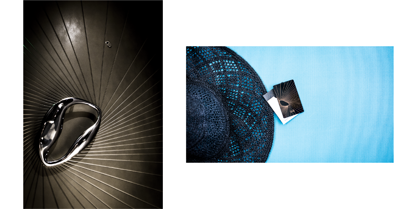
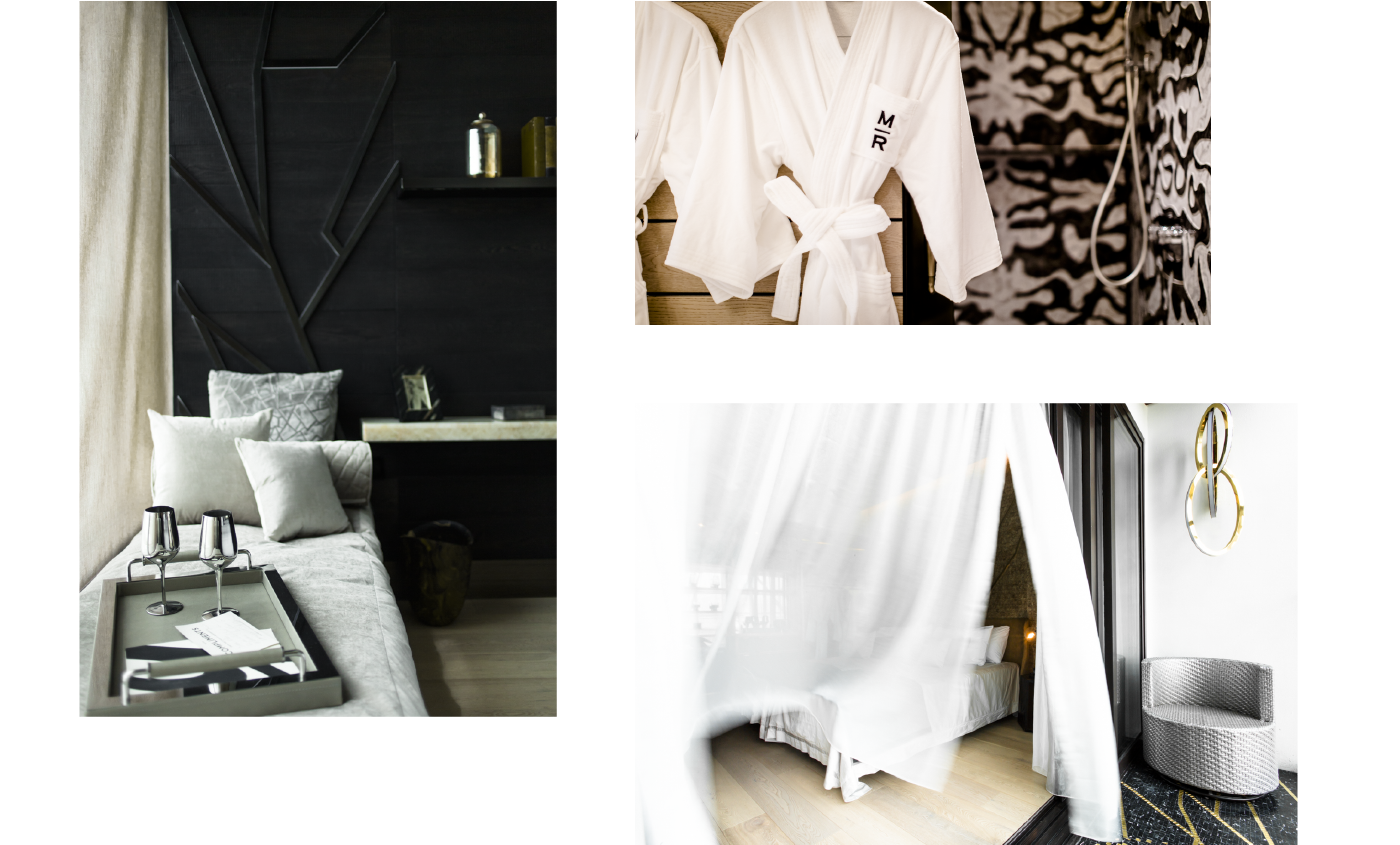
Gulla Jonsdottir's work is so much of a design and architecture statement, that we felt we needed to design the brand so that it could blend with the building.
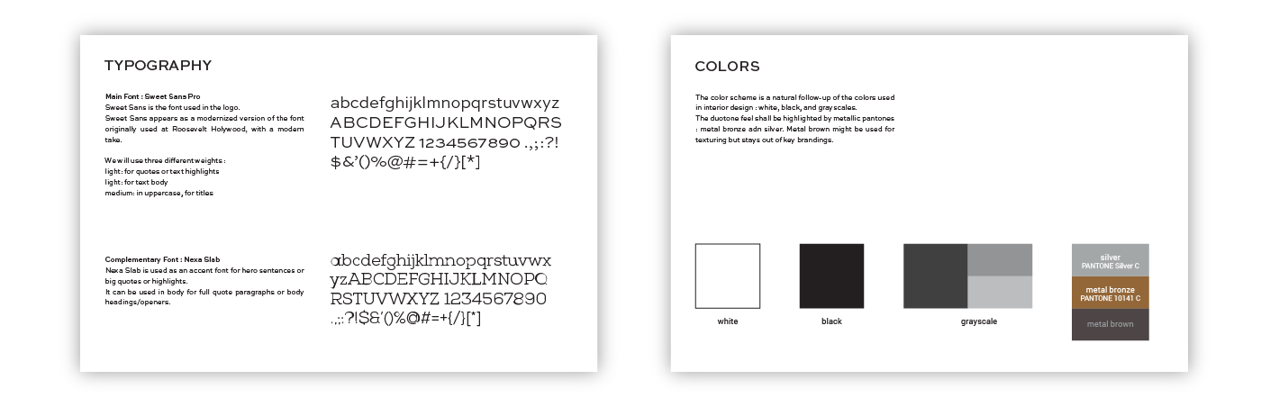
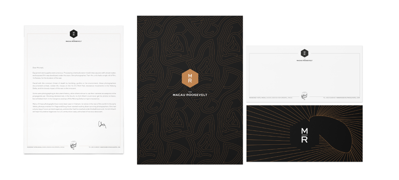
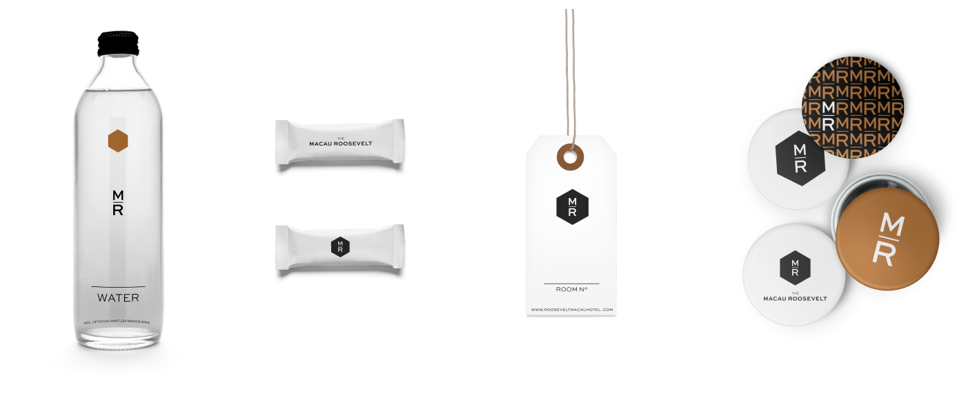
We have decided to base the brand on colours and patterns found on the hotel: brass and black marble defined the colour scheme, door sculptures, tiles, etc... defined the look and feel of the brand.
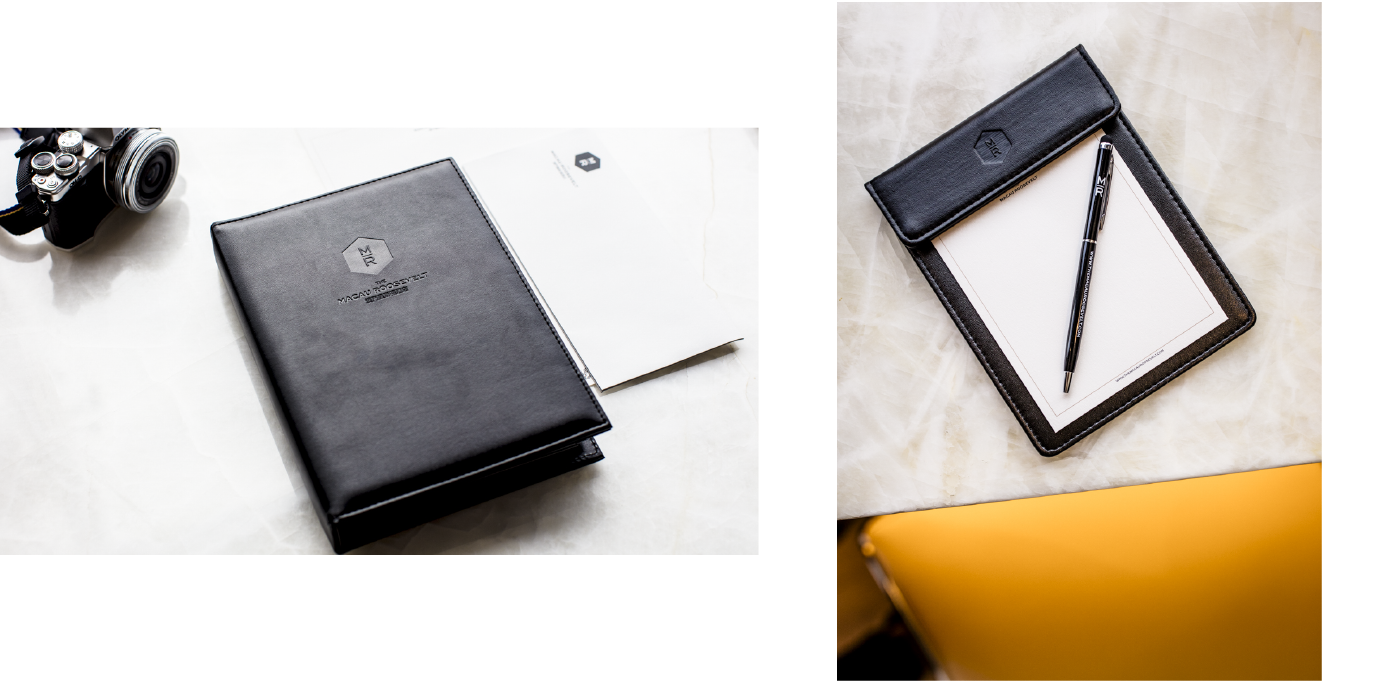
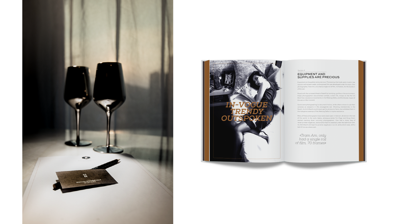
The collaterals are faithful to their environment, but also respect to what has been done in the Hollywood property.